Free SaaS Homepage Audit Worksheet for Google Sheets & Excel
Make the most of your homepage with this free homepage audit worksheet
How do you know if your homepage is working for you?
We analyzed 115 SaaS websites by hand to discover what makes a homepage successful. Based on that research, we created a free homepage audit worksheet to help you get the most out of your homepage. This worksheet will help you assess your homepage in 5 different areas: reporting, search engine optimization (SEO), conversion, website performance, and technical fixes.
Reach your audience with ease
Start a 14-day free trial. No credit card, no setup, no hassle.
Table of Contents
What Should You Put on Your SaaS Homepage? SaaS Copywriting Lessons from 115 SaaStr Sponsors
What should you put on your SaaS homepage?
- Should you left-align or center-align your homepage SaaS copy?
- What visuals should you use on a SaaS homepage?
- What should your SaaS copy say about your product, and where?
- What call-to-action should you put on your SaaS homepage?
ActiveCampaign has written about copywriting before, especially for landing pages, but what about SaaS homepages?
Your homepage can convert leads directly – or point them to the best info for them. It can be a big brand play – or focus on educating prospects about your product. Which approach is best for you?
To answer that question, we studied the homepages of 115 sponsors of the 2020 SaaStr Annual conference. We asked:
- How do SaaStr sponsors format their copy?
- What types of visuals are most common on SaaS homepages?
- Where on the page do SaaS homepages most often describe what their products do?
- What types of CTAs are on SaaS homepages? How many?
Below, you can find answers to each question – along with SaaS copywriting insights to help you create a more compelling, higher-converting SaaS homepage.
Should you left-align or center-align your SaaS copy?
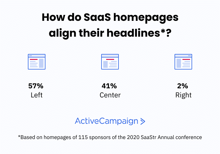
In this research, SaaStr sponsors left- or center-aligned their homepage SaaS copy:
- 56.52% of SaaS homepages had left-aligned headlines
- 40.87% of SaaS homepages had center-aligned headlines
- 2.61% of SaaS homepages had right-aligned headlines

What’s the best practice when it comes to aligning your homepage copy?
Eyetracking research from Nielsen Norman Group shows that many online readers use an “F-Shaped” pattern to scan websites for information.
![]()
Readers start at the upper left and read across. They tend to scan down the left margin and read the width of the page less as they continue reading (Source: Nielsen Norman Group).
For people who read left-to-right languages like English, the top left of the page is a natural place to start reading (it’s where the information starts).
That said, not all readers use an F-shaped pattern. Nielsen Norman Group cites three factors that make people more likely to scan in an F-shape:
- Walls of text or unclear formatting (hard to understand where to find the information)
- The reader is trying to find the information very quickly
- The reader isn’t particularly invested in the content of the page, so they scan instead of read
As long as your homepage hero is relatively uncluttered, readers should be able to quickly locate the important information on the page.
You can help readers locate the most important information on the page by having your imagery point towards that information.
-(1).jpeg)
An eyetracking study found that people looked at the headline more often if the baby was also looking at the headline (Source: James Breeze).
Although over half of the SaaS homepages in this research had left-aligned copy, you’re probably safe if your text is left-aligned or center-aligned. You can always test it!
What visuals should you use on a SaaS homepage?
SaaS design trends change quickly – with many companies learning and adopting the styles of other SaaS websites.
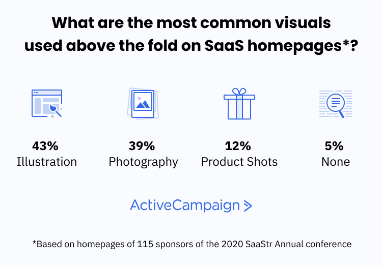
In our research of SaaStr attendees, we categorized visuals as “no visuals,” “illustration,” “photography,” or “product shot.” What visuals were most common on SaaS homepages (above the fold)?
- 43.48% of SaaS homepages used illustration in their visuals
- 39.13% of SaaS homepages used photography in their visuals
- 12.17% of SaaS homepages used product shots in their visuals
- 5.22% of SaaS homepages did not have any visuals above the fold

Anecdotally, SaaS websites have started to move towards illustration as the main visuals on websites. Though not a SaaStr sponsor, social media scheduler Buffer is a good example of this type of website.
.png)
Buffer’s homepage uses an illustration style that’s becoming more common in SaaS (Source: Buffer).
The other most common visuals are photography and product imagery. Which makes the most sense for SaaS businesses? There are pros and cons:
- Illustrations are visually interesting, but don’t necessarily communicate product functionality/value. If brand is important for your SaaS business, a distinctive illustration style might help you stand out in crowded platforms.
- Photography can be useful to show how products integrate into people’s lives. Images of people (especially faces) are also more likely to attract attention.
- Product imagery is the most effective visual to communicate the benefits of a product. At the same time, not all SaaS product UIs are visually interesting, and you may have to update this imagery if your product changes significantly.
Of the 3, ActiveCampaign recommends using product imagery when you can. So does advertising great David Ogilvy, writing in Ogilvy on Advertising:
- “Show the package. Commercials which end by showing the package are more effective in changing brand preference than commercials which don't.”
- “Show the product in use. It pays to show the product being used, and, if possible, the end-result of using it.”
Why? Showing the product helps people imagine themselves using the product and getting its benefits.
“Two of the most important characteristics of good design are discoverability and understanding. Discoverability: Is it possible to even figure out what actions are possible and how to perform them? Understanding: What does it all mean? How is the product supposed to be used? What do all the different controls and settings mean?” – Don Norman, The Design of Everyday Things
How can you avoid the cons of product imagery? Instead of using screenshots, use slightly abstracted versions of your product, with annotation describing the benefits of the features you highlight.
ProfitWell, a SaaStr sponsor, does this well on their home page.
.png)
Product imagery on ProfitWell’s homepage does a nice job of giving readers a feel for what the product contains without overwhelming them (Source: ProfitWell).
We take an approach similar to this at ActiveCampaign – showing the product in a way that makes it easy for a scanner to understand the important message.
.png)
Showing an automation gives people a feel for the product, without making us update the images every time we make a tweak to our UI (Source: ActiveCampaign).
If you don’t take this approach, don’t worry! 87.83% of SaaStr sponsors used something other than product shots above the fold of their homepages.
What should your SaaS copy say about your product, and where?
Where’s the best place on your homepage to put information about what your product does?
- In the main headline
- In the body copy above the fold
- In the above-the-fold imagery
- Below the fold
- Nowhere
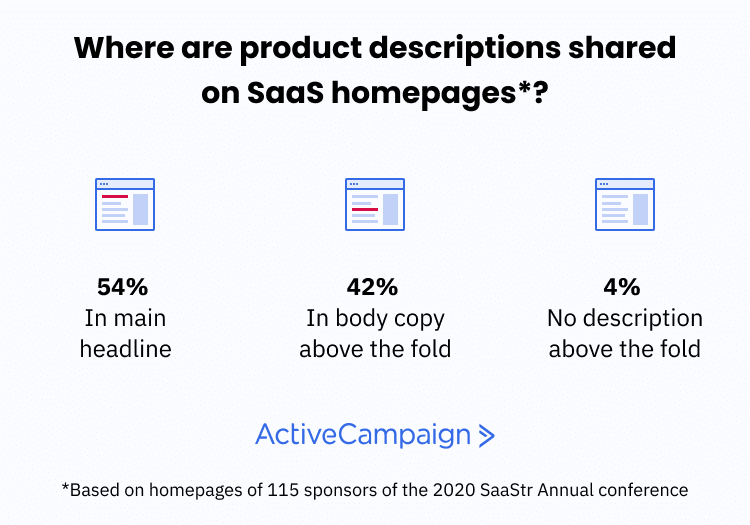
Where did SaaStr sponsors describe their actual product on the homepage?
- 53.91% of SaaS homepages shared a product description in the main headline
- 41.74% of SaaS homepages shared a product description in body copy above the fold
- 4.35% of SaaS homepages did not share a product description above the fold

If people are going to buy from you, they need to understand what you do for them.
But there are a few ways that you can help people understand what you do:
- Lead with their pain point and promise an answer to it
- Share the overarching benefit of your product
- Tell readers what type of product you sell
- Lay out a compelling feature of your product
Which should you use in your homepage headline?
There are arguments for each situation. In her book Obviously Awesome, positioning expert April Dunford argues that you should make it easy to understand what category your product is in. Why?
“Market categories are one way that customers organize products in their minds. Declaring that your product exists in a certain market category will set off a powerful set of assumptions in customers’ minds about who your competitors are, what the functionality of the product should be and what the pricing is like.” – April Dunford, Obviously Awesome
Among SaaStr sponsors, several take this approach on their homepage.
.png)
Bandwidth says exactly what their product is in the headline of their homepage (Source: Bandwidth).
What about the other approaches? What about the age-old advice of “sell benefits and not features?”
Several of the other SaaStr sponsors promise overarching benefits before diving into the specifics of their solutions.
.png)
PandaDoc chooses to highlight a high-level benefit of using their product (Source: PandaDoc).
Finally, some SaaS apps target an incredibly specific use case – in which case the best bet is probably to directly state that use case.
-(1).png)
Muzzle is an app that hides screen notifications – and directly states that on their website (Source: Muzzle).
What’s the best approach for your homepage? It depends on your business:
- If you have one product in an established category, state the category and a differentiator
- If you have a product in a new category, target a pain point and show how you solve that pain point
- If you have multiple product lines that address a range of pain points, state the overarching benefit that you deliver across all your products (then point people to product pages)
That last bullet point is challenging – and it’s a problem a lot of businesses run into as they scale and add new products. Atlassian does a nice job of highlighting a benefit above the fold, then directing people to individual products for specific problems.
.png)
Atlassian shares their overall benefit above the fold before getting more specific below the fold (Source: Atlassian).
Below the fold, Atlassian directs people to learn more about specific tools.
.png)
Because Atlassian has so many tools, they need to direct people to the right tool for their use case (Source: Atlassian).
And, of course, it’s SaaS copywriting – so a mix of all these approaches can work. A lot of the details depend on exactly what product you sell and who you sell to.
What call-to-action (CTA) should you put on your SaaS homepage?
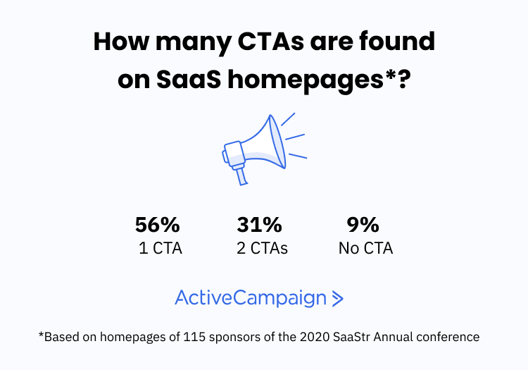
What do SaaStr sponsors ask people to do on their homepage? In this research:
- 55.65% of SaaS homepages had 1 call-to-action
- 31.30% of SaaS homepages had 2 calls-to-action
- 8.70% of SaaS homepages had 0 calls-to-action
- 4 SaaS homepages had 3 calls-to-action, and 1 homepage had 4 CTAs

The most popular SaaS homepage CTAs were:
- Start a free trial
- Get a demo
- Learn more
- Pricing
- Watch a video
Your SaaS homepage is the part of your website that most people will see. That means it’s the place you should put your most important calls-to-action.
But what are your most important calls-to-action? And when does it make sense to put multiple CTAs above the fold?
Giving people more choices can sometimes be a good idea – but be aware that every choice you offer someone can lower the chances of them making a choice at all.
Hick’s Law states that people take longer to make a decision the more options they have:
.jpg)
When people have more options, it gets harder for them to choose one (Source: Shopify).
Other research on psychology and user experience (which we summarize in this article) shows that adding more choices can lead to worse decisions.
So...it sounds like you should only put one CTA on your SaaS homepage, right?
Maybe. Your homepage is the section of your website that gets the most visibility, but that also means that traffic to that page is unsegmented — and you could be talking to people who have different needs on the same page.
When could it make sense to add more CTAs to your homepage?
- If you serve a wide range of customers, some of whom are higher touch (demo) vs self-serve (trial), having both a demo CTA and a free trial CTA could make sense for you
- If you have long sales cycles (especially enterprise customers), and people are unlikely to convert to a customer just by starting a trial, a demo or video CTA could make sense for you
- If you have a small sales team and you don’t have the resources (yet) to demo everything, a free trial or video CTA could make sense for you
The exact job of the homepage depends on your business. Sometimes the role of the homepage is conversion, but sometimes it’s segmentation – directing visitors to the page that most closely serves what they’re looking for.
Conclusion: SaaS copywriting for your homepage
What does this research say about your SaaS homepage?
- Most SaaS homepages have left-aligned copy – but almost as many are center-aligned
- Illustrations are the most popular type of visual, closely followed by photography. Most SaaS homepages in this study did not show the product above the fold.
- Product descriptions are almost always included in the headline or body copy
- Most SaaS homepages have just one CTA, but some have two CTAs targeting different stages of the buying cycle
How does your homepage compare?
Reach your audience with ease
Start a 14-day free trial. No credit card, no setup, no hassle.