Calculate Cart Abandonment
Calculate lost revenue from cart abandonment
If your shopping carts get abandoned, you could be losing sales without even realizing. This abandoned cart calculator shows you how much abandoned carts cost you – and how much you could make by adding an abandoned cart email.
Join our newsletter for additional eCommerce and marketing advice
Table of Contents
7 Reasons for Abandoned Carts (and How to Reduce Checkout Friction)
According to SaleCycle, 77% of all online shopping carts are abandoned.
More than three quarters of the people that add items to their shopping cart leave without buying anything. For every person that buys from you, three people were on the cusp – and decided against it.
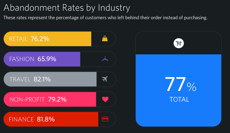
That’s 3 out of 4 people (Source: SalesCycle)
Cart abandonment is a huge source of lost revenue for ecommerce stores.
Could you imagine if 77% of the people in a Target walked around the store adding things to their shopping carts and then walked out without buying anything? It doesn’t happen.
But the convenience of online shopping, the lack of urgency, and the ease of comparison shopping makes abandoned carts a real problem.
Fortunately, abandoned cart emails can help you solve it.
In this post, you’ll discover:
- Why people abandon their carts
- How you can reduce cart abandonment without ever sending an email
- 5 best practices for abandoned cart emails
- Examples of great emails – and a breakdown of what they do well
- Why abandoned cart emails are only the first step
What are abandoned cart emails?
Abandoned cart emails are a simple but powerful tactic that can skyrocket your sales.
Research from Moosend shows that abandoned cart emails have a staggeringly high 45% open rate. Of abandoned cart emails that are opened, 21% are clicked. Of the people who click, 50% make a purchase.
That means that if 1000 people abandon their carts and you email all of them, you can expect about 50 sales. That’s 50 customers that would have disappeared – but that you now have the opportunity to turn into repeat customers.
Best of all, abandoned cart emails run automatically. Once you set them up, they’ll increase your sales until you turn them off.
So what are abandoned cart emails?
Put simply: a visitor to your website adds an item to their shopping cart and then (like 77% of all people) leaves without completing a purchase.
Some time later, you send them an automated email reminding them that there are still items in their cart.
That’s it!
As a concept, abandoned cart emails are simple. Remind people that there are products they are interested in, and more of them will finish their purchases.
But there are some nuances to creating abandoned cart emails that get sales. Not every abandoned cart email converts well. Understanding the entire purchase experience it crucial to reducing your cart abandonment.
Why do people abandon carts?
Your abandoned cart emails will be more effective if you understand why people are abandoning their carts in the first place.
Does your checkout page have a lot of distractions? Is the payment process hard or annoying? Did your visitors just forget?
Here are a 7 reasons that people abandon carts:
- Distractions
- They forget they have a cart
- Price
- Comparison shopping
- They were just browsing
- Confusion
- Barriers to checkout
Before you set up abandoned cart emails, ask yourself what your emails need to accomplish – and if you might be able to accomplish those goals in a better way.
If prospects are confused about their payment options, can you improve your checkout page? If your visitors are distracted, can you eliminate distractions?
Let’s look at a few ways you can reduce friction on your checkout page – as a precursor to designing an effective abandoned cart email.
Reduce friction with your cart and checkout page design
If fewer people abandon their carts, you get more sales (duh). But what may be less obvious is that you can also get more effective abandoned cart emails.
When you know that your checkout page design converts, the list of things you need to include in your abandoned cart email shrinks. You don’t need to address every reason that someone could decide not to buy, so your reminders get more effective.
Let’s look at a few examples.
The ultimate in friction reduction: One-Click Ordering
Amazon is famous for its innovations in checkout design, cart reminders, and retargeting. In 1999, they developed the ultimate checkout friction-reducer: one-click ordering.
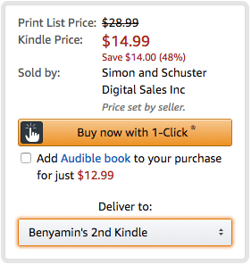
Super low friction
The ability to purchase with a click is huge. As long as you have an Amazon account, you don’t need to go through an arduous checkout process.
No more fumbling for your credit card.
No more entering the same information over and over.
One click. Bought. Finished.
Amazon extended its one-click feature with Amazon Dash buttons.
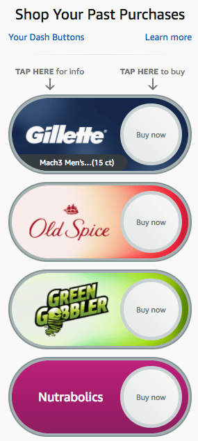
Dash buttons appear on your Amazon home page, but they also exist as physical buttons that you can leave around your house to restock essential products.
Amazon’s one-click order was a huge innovation – so huge that they patented it and sued Barnes & Noble when the bookstore came out with a similar online feature.
Fortunately, Amazon’s patent expired in September of 2017.
Expect to see more one-click ordering options in coming years. The functionality may be out of reach for small ecommerce stores right now (at least until an ecommerce provider develops it), but it still serves as an outstanding example of friction reduction.
Increase prominence with checkout button color and on-site cart reminders
You want to make it easy for people to check out. Two on-site adjustments you can make are changing the color of your checkout buttons and reminding site visitors of their carts before they have the chance to leave.
In 2009, Unbounce started a button-color craze with a short blog post about “The Big Orange Button.”
The idea that button color affects conversions is common – but there’s a misconception that the color of the button itself is important.
It’s not.
Blue or green or orange or turquoise buttons don’t always convert better than any other color.
Buttons convert better when they are visually distinct from the rest of a page.
It’s the context that determines which colors convert best.
Take this example from Zappos.
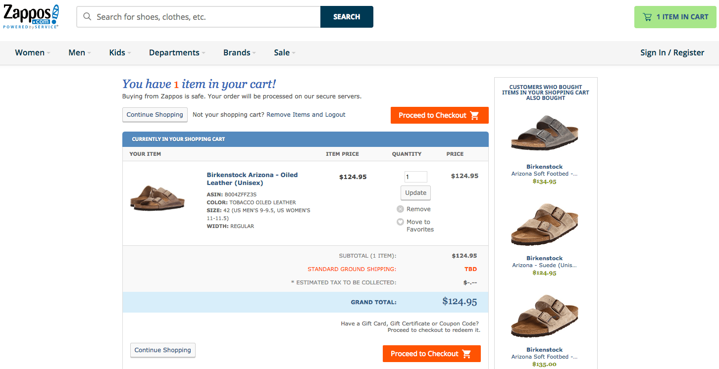
The Zappos website uses a blue and green color scheme, so the cart page uses an orange-ish checkout button. The visual contrast is high, which draws the eye to the button.
Choose a button color that contrasts with the overall color scheme of your site. Complementary or triadic colors are usually a good option.
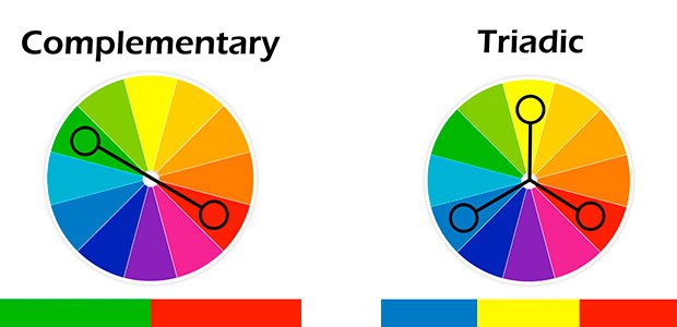
Source: ModernMan Collectio via OptinMonster
Of course – you should test this. Button color can definitely have an effect on conversions, but it isn’t as simple as “[Color] always converts better than [other colors].”
Beyond button color, you can help catch visitors before they leave by adding a sidebar to your site.
Fab does this well, with a sidebar that follows you around and even allows checkout without navigating to a new page.
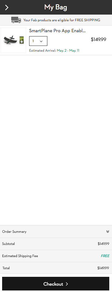
This kind of cart reminder is relatively less common, but gaining ground. It makes sense – forgetting is one of the major contributors to abandoned carts. This makes it much harder to forget.
Simple payment and account creation
No one wants to be forced to create an account. And everyone wants to just pay as quickly as possible – I don’t want to dig out my credit card number unless I absolutely have to.
There are definitely benefits to getting people to set up an account with you. You get more information about them, so you can offer them products related to their interests. You can also store their payment and billing information, which reduces friction for their next purchase.
Still, people resent being forced to make an account. So you need to give them the option not to.
Here’s how Apple approaches account sign-in, with a page between cart and checkout.
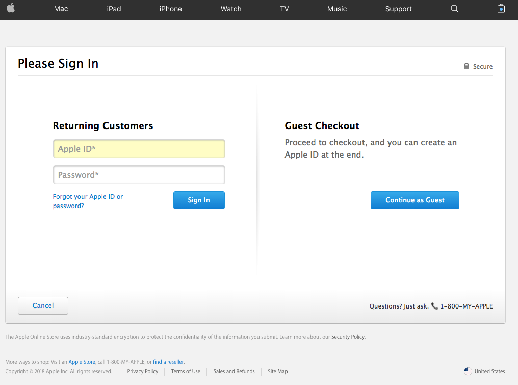
If you don’t want to bother with an Apple ID, it’s easy to continue as a guest.
Fab takes a different approach, allowing you to log in using your Facebook account.
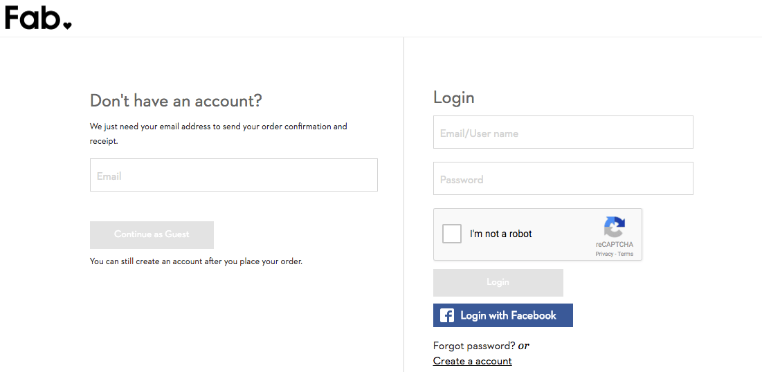
If you can let people log in using their existing Facebook or Google accounts, it’s often a good idea to do so. I’m not likely to create an account manually, but if I can do it at a click of a button you’re much more likely to get my information.
After account creation, make it clear what kinds of payments you accept.
ASOS does this well by listing out payment options below the checkout button, along with some nice, subtle urgency.
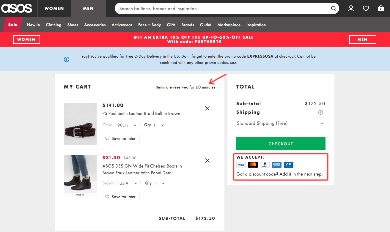
The note about discount code entry is a good touch as well – you don’t want people hunting and clicking around your page looking for a place to add their coupon codes.
Remember: lack of clarity kills conversions.
Optimize your cart and checkout pages to reduce friction. But when people abandon their carts anyway (and many will), get ready to follow up with an email.
5 abandoned cart email best practices
What goes in an abandoned cart email?
There are as many possibilities for an abandoned cart email as there are possible email designs. Your brand, product, and type of customer all affect what you put in an abandoned cart email.
Still, there are a few things that most abandoned cart emails include.
1. Conversational tone
Do. Not. Guilt trip.
It can be tricky to strike the right tone in an abandoned cart email. A lot of the time a cart gets abandoned because the customer forgot about it or got distracted. But sometimes people just weren’t that interested in what you had to offer.
You don’t want to be too pushy.
Yes, you need to push for the sale. And yes, this person has already left you behind once. But you’ll notice that most abandoned cart emails have a lighthearted, conversational tone—because any other kind of tone risks making a bad impression.
2. Show the product
When a cart gets abandoned, you know the product someone almost bought.
Show it to them.
Even if someone abandons their cart, they have a demonstrated interest in the products they add. Showing them those products can help them remember why they were interested in the first place.
Anything you can do to get people to imagine themselves using your product is likely going to increase conversions.
3. Highlight benefits to activate loss aversion
To help people remember the value of your product, highlight its benefits.
You want people to imagine themselves using your products. In your email, talk about what it’s like to use your product. Talk about the problem it solves.
And phrase your benefits in terms of what your customer would miss by not buying.
According to psychology, humans tend to value not losing something more than they value getting something. This concept is called loss aversion, and is especially well-suited to abandoned cart emails.
4. Address objections
Are people afraid that your product will be easy to use? Are they worried you’ll sign them up for a subscription? Are they unclear on exactly what you have to offer?
Customer research and usability testing can help you uncover why people aren’t buying. Address the concerns you find in your abandoned cart email.
5. Make it easy to continue
Above all, the next step needs to be crystal clear.
A single, prominent button to recover carts is often the way to go. There should be actually no question in your reader’s mind what you want them to do next. Nor should it seem difficult for them to complete their purchase.
Make it easy.
Let’s look at some examples.
Abandoned cart email examples
Sumo: The power of loss aversion
Source: Sumo, via Copy Hackers
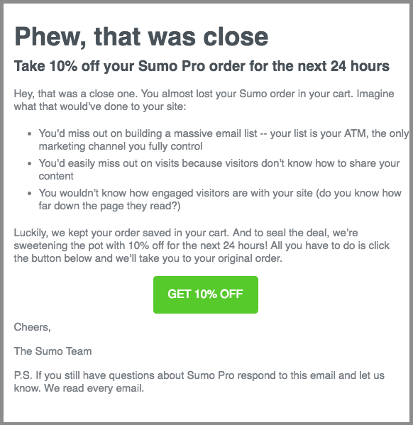
Sumo is an interesting abandoned cart example because Sumo doesn’t sell a physical product. It’s hard to showcase the product when your product is software for websites.
Instead, Sumo doubles down on benefits and loss aversion.
- “You’d miss out on building a massive email list”
- “You’d easily miss out on visits”
- “You wouldn’t know how engaged visitors are”
By highlighting what their product helps customers achieve – and phrasing it in the negative – Sumo tries to entire people to finish their order. With 10% off as a nice bonus to nudge them over the edge.
23andMe: Short and to the point
Source: 23andMe, via Really Good Emails
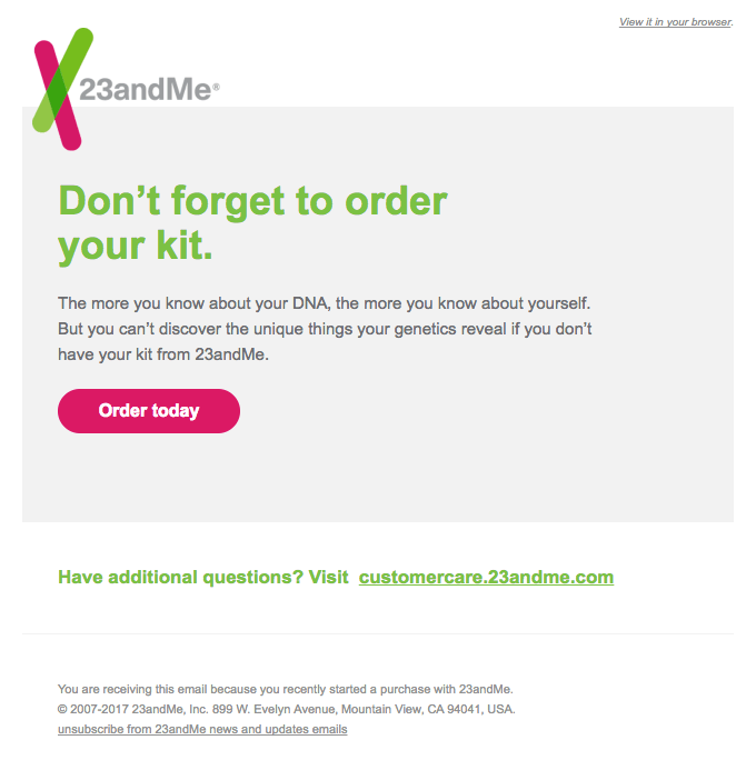
23andMe proves that your emails don’t need to be complicated.
This email quickly reiterates the benefits of their product. It highlights some loss aversion. It follows up with a color-contrasted button prompting people to finish their order.
Sweet. Simple. To the point.
Whisky Loot: Benefits, no objections
Source: Whisky Loot, via Really Good Emails
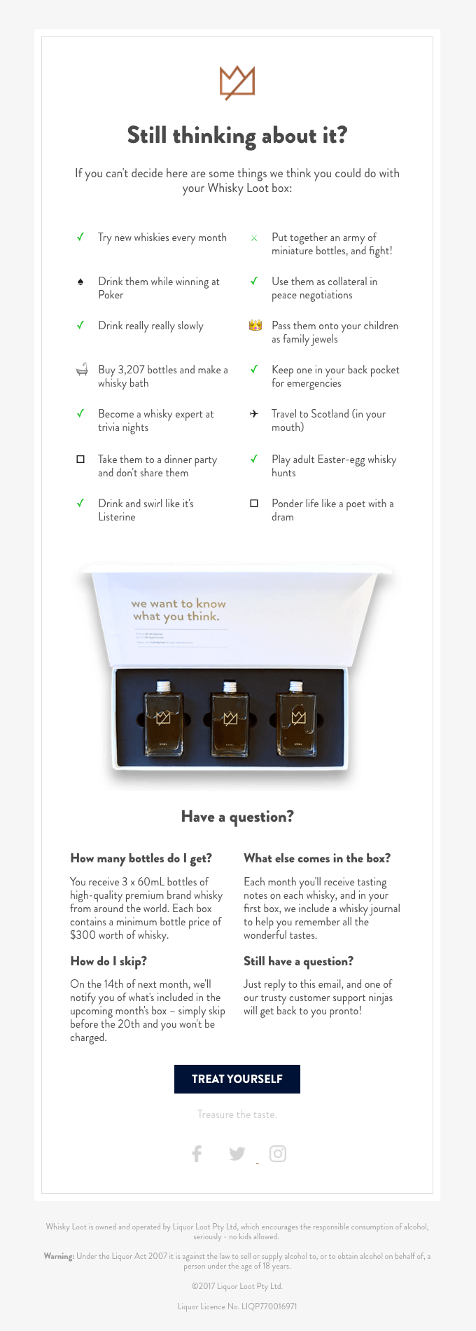
This is a slightly unusual email in that it really hammers home the benefits of the product. It’s long—but it takes every inch of space to make its point.
Chock-full of lighthearted tone and personality, bullets like “drink them while winning at poker” and “drink and swirl like it’s Listerine” are memorable.
This email does a few other things well too. It highlights the product. It explicitly addresses some possible objections.
Ultimately, what makes this email effective is that it helps you envision yourself using the product.
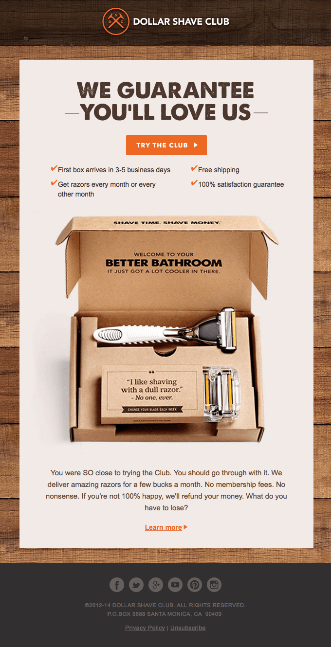
Dollar Shave Club: Reducing risk with a guarantee
Source: Dollar Shave Club, via Really Good Emails
“What if this isn’t worth it?”
That’s a common objection that every sale needs to overcome. Whether you sell online or in person, people want to know that they’re getting value out of their investment.
This email gives you a nice visual of the product and reminds you of the benefits (no one likes shaving with a dull razor). It highlights fast, free shipping.
Most importantly, it makes a guarantee. “If you’re not 100% happy, we’ll refund your money.”
Removing the risk of a purchase leads to more customers.
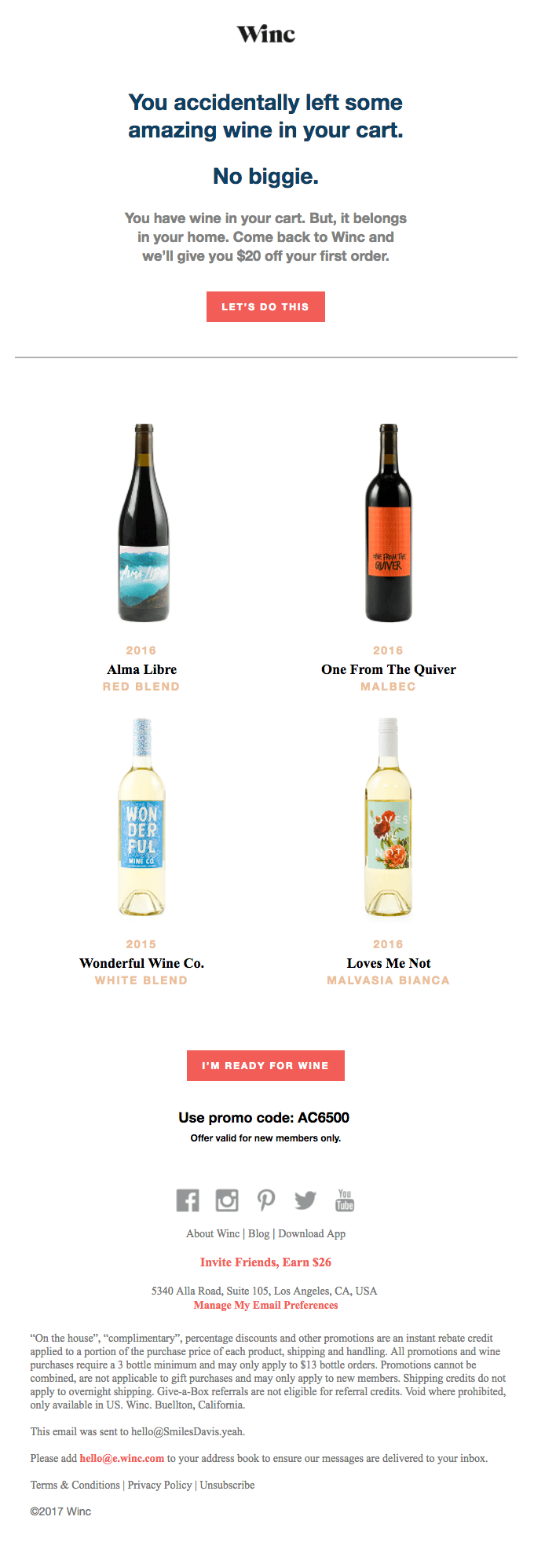
Winc: Let the product shine
Source: Winc, via Really Good Emails
Sometimes all you need to do is show your product.
Winc leads with a conversational tone and adds a nice $20-off bonus to help snatch up first-time customers.
Then, they follow up with some simple product shots. No need to get fancy – showing your product reminds people of why they wanted it to begin with.
A final button that contrasts with the white background brings home the conversion. The promo code directly under the button is a nice touch, and likely increases clicks.
Conclusion: Beyond abandoned cart emails
ActiveCampaign lets users with connected Shopify stores trigger abandoned cart email reminders automatically.
When you add automation to abandoned cart reminders, you can take your cart recovery to the next level – by recovering more carts and offering new, personalized product recommendations.
In ActiveCampaign, you can trigger automations when a cart is abandoned.
More importantly, you can segment your automations based on 7 abandoned cart conditions.
- Has Abandoned Cart
- Doesn’t Have Abandoned Cart
- Has Recovered Abandoned Cart
- Has Not Recovered Abandoned Cart
- Total Value of Last Abandoned Cart
- Product Count of Last Abandoned Cart
- Product Name in Last Abandoned Cart
To use the last condition as an example – segmenting your automations would let you follow up with specific product recommendations based on your customers’ interests.
Abandoned carts are a fantastic opportunity for personalized marketing. Adding automation to abandoned carts helps you make the right upsell and cross-sell offers to the right people at the right time.
Save time and grow your business today
Yup, free. No credit card required. Instant setup.


Increased our revenue by over 150% in a year
“The automations have enabled me to get more engagement with my subscribers. My targeting is much better and this has enabled us increase our revenues by over 150% in the last 12 months.”
— Deji DJ S., 5-star G2 Crowd review